Forget Mobile-First or Mobile-Only-- It's Time to Get Truly Responsive
- What are websites?
- What is RWD?
- What is Mobile-First Crawling?
- Is Google really crawling Mobile, First?
- What is Google doing?
- What are your users doing?
- What are you doing?
- Encouraging Testing
- MFT + Puppeteer
- Accessibility Tree + Screen Readers
- The DOM
- The Search Object Model
- Conclusion: Why you should learn CSS
- SOURCES
If you’re thinking about your website in terms of the desktop site, welcome to the 2010s. If you’re thinking about it mobile-first, welcome to the 2020s. But it’s 2021. It’s time to think about your site the way Good Designers do- it’s time to get responsive.
This year, there were two different celebrations I want to bring your attention to. The first was the 11th birthday of Responsive Web Design, on May 25th. The other was Google’s final switch over to mobile-first crawling. But to understand what these two things have to do with each other, we’re going to have to step back-- all the way back to the 90s, to understand how the web works.
Contents:
- What are websites?
- What is RWD?
- What is Mobile-First Crawling?
- Is Google really crawling Mobile, First?
- What is Google doing?
- What are your users doing?
- What are you doing?
- Encouraging Testing
- The Search Object Model
- Conclusion
- Sources
What are websites? #
Originally, you could think of websites as HTML (hyper text markup language) files that are hosted on folders, on computers called servers. If you want to make a rudimentary, basic, “hello world” website, you can write
<html>

<body>

<h1> Hello, world</h2>

</body>

</html>
On a plain text document, save the file as html, and access the file using your browser. Your browser accesses the file on your server-- your computer’s server-- and because you can access your own local files, the browser can interpret the HTML and turn it into a web page.
And for a long time that was all websites were. Then we realized that the sites were kind of ugly, so we created Cascading Style Sheets, and we wanted to interact more, so we created Flash (a mistake) and JavaScript (slightly less of a mistake.) On the backend, you can use all sorts of languages, from PHP to Python, to then build HTML for a browser to interpret.
This all seems pretty simple until you realize how browsers are built.
Browsers aren’t all created from the same template, from people with the same priorities. Part of the problem of the Browser Wars of the 1990s was that the web was exploding, and people were coming up with all sorts of new-fangled CSS and HTML.
Let’s digress for a second (I’m good at that) and look at how to build your own basic web browser.
Everything about computers is basically phones. We’re all playing a mass version of phone tag with each other-- and when you realize that, a lot of the modern internet landscape makes a lot of sense. What a browser does, is, in essence, call a computer server (even if you’re using a cloud, that’s a server) and say “hey, send me the code at this IP (which my user knows as a friendly URL.” Then the server can either send the browser _fully rendered HTML in the browser, _(server-side rendering) or a bunch of code--puzzle pieces--that might not already be HTML that the browser (the _client) _has to put together (client-side rendering.)
(A web browser is a commonly used client to access applications online. Browsers access apps and websites using HTTP. In case the use of “Client” here needed more explanation!)
I think a thing that is often not clear here is that you’re basically always looking at HTML-- be your site rendered on the server or in the client, even if you never touch HTML, unless you’re an entirely JavaScript rendered app with nothing in the DOM, you are making a website with HTML. You could think of HTML as a programming language with a browser as a compiler (this is probably my spiciest take today.)
The browser then interprets all of the files it gets sent and turns them into the web page. The browser does this by creating a Document Object Model (and please expect a long essay from me about all the kinds of object models that are out there at some point before 2024). It reads the HTML, and then as it goes down the HTML document it finds all the style resources and JavaScript and goes off to read those bits too. Usually, the browser has to stop rendering the HTML to go look at the JS and the CSS-- that’s why those things are called render blocking resources. The browser is blocked_ from_ rendering until it’s read those resources.
So the browsers aren’t all based on the same system, and they have to interpret the code. There was no real standard for this.I think it’s useful and important to have this kind of baseline understanding of how rendering works. Because different browsers are built to different specifications, the engineers behind these browsers don’t all have the same specs.
For example, a developer creates some new specification for a CSS thing that doesn’t exist yet. There isn’t really a standard for implementing this, and there are tons of browsers, all with different ideas of what the most important thing to add next is. So some browsers can read the CSS, and some can’t. In the early days, it was as chaotic as this sounds. Some designs would just not work on certain browsers.
This was obviously untenable, and the fix was communication. If you’ve ever seen something like “moz-border-radius” in a CSS file, that’s a fallback specifically for the Mozilla browser. They’re called “vendor prefixes”, and they exist for when a web proposal hasn’t been standardized yet, but the browser company has worked on an interpretation of that proposal. This is why the website CanIUse is so useful!
For a fictional example, let’s say we want to propose a CSS heart shape frame that people can use. We put the suggestion out into the universe. Firefox jumps on it right away, but the Safari team are dragging their feet. Moz would put out a version of the spec that might be different from the ending spec, which would be like “moz-heart-border”. Then eventually, when the spec is accepted by everyone, there would be a CSS property called “heart-border” you could use.
After the browser wars of the 90s (when there were hundreds of browsers) we kind of settled down to a “Big 3”, then a Big 2, and then… well, at least now we have that process. More on this later.
What is RWD? #
On May 25th, 2010, web designer Ethan Marcotte published an article entitled “Responsive Web Design” on A List Apart.
When we create websites, style them, make them interactive, all that stuff, we are building something in a quantum state-- it exists, as it does, based on observation. Schrodinger can haz catz, users can haz websites. Have you ever seen the subreddit “Will it run DOOM?”

Responsive web design is kind of a response to that-- not with DOOM, obviously, but with the Web. Responsive Web Design was proposed as a reset to the static way design existed in the past. When you design for type, you know how it’s going to look on the page. When you design for the web, though, you have no guarantee of the size, or shape, or color, or memory of the machine on the other end of the line. To take it further, you also don’t know if your user is colorblind, or juggling three kids in two hands, or has a cat blocking the keyboard, or hates using proper mice. And to take it to the furthest, you don’t know what assumptions the user is coming to the table with: you don’t know if they know what a hamburger menu is, or blue means a link, or when they should give up on loading.
The web is constantly moving and flexible: there are new tools and changes every week, in different browsers, proposed by different people. Anyone who has paid attention to AMP/the flashiest CSS library/Flash/some other technology can understand this. The web is a shifting ocean, constantly moving from the architecture we use to build the web, to the browsers that interpret it, to the people who use it.
People are using new things to browse the web! We used to have shitty Motorola phones with blocky, too expensive mobile internet, and now everyone is always on their phones. But people also use the internet elsewhere: still on laptops and desktops, and also on old DS’s, smart fridges, using screen readers and other assistive devices, programming with a Nokia feature phone, and more. Responsive Web Design is seeing your web page as flexible rather than solid, able to react to new environments, instead of being static.
Now let’s talk about Google.
What is Mobile-First Crawling? #
For a search engine to work, you need three components: you need to crawl, index, and rank. Your search engine needs to find content, figure out what it’s about, and figure out how good it is at answering a query. For a very long time, Google used a pretty static Googlebot crawler.
A crawler, or spider, is a computer program that does what you do on the internet: it opens up a page, parses it, and cleans it up. Let’s make a super simple scraper with python!
import requests

# from bs4 import BeautifulSoup

from sys import argv

url = "https://"+ str(argv[1])

print(url)

webpage_response = requests.get(url)

webpage = webpage_response.content

print(webpage)
Save as “firstscrape.py”, then use the command line to give the command:
python firstscrape.py jessbpeck.com.
This will, if you have python installed, and also beautiful soup, get you a web page.
But the response you get is a pretty good look at the kind of thing a crawler parses: ugly code! And Google parses tons of way uglier code every day. Crawlers “use” a version of a browser to understand the code they run into. Remember, browsers interpret code. So Googlebot is using Chrome’s interpretation of code. On top of this, Googlebot used a static version of Chrome, that wasn’t at the same level as the updated version of Chrome. Remember what I said about browsers earlier? Well, the same thing kinda happened with Googlebot and Chrome itself-- users could see a feature in Chrome, but Googlebot was a couple of releases behind, and couldn’t see it. Googlebot was also bad at JavaScript and CSS, and some other kind of tricksy things webmasters used to do.
It was Desktop only: so Googlebot was interpreting code through a Chrome Desktop window.
Then, in 2017, Google announced mobile-first indexing, and everyone collectively lost their minds. Okay, SEOs lost their minds. Most other people didn’t really notice or care. But what is Mobile-First Indexing?
Is Google really crawling Mobile, First? #
Mobile-First Indexing has nothing to do with how good a site is, or how ready it is to be crawled on mobile. It meant that Google saw more and more people accessing sites from their mobile phones, and realized that meant they needed to figure out if the mobile sites were any good.
When Googlebot crawled Desktop: they would crawl the desktop version of a site, see a bunch of great content for “water bottle reviews,” and chuck that to the top of the search results. But in this, the age of nonresponsive, m.dot site design, the mobile site would be a link to the home page and a suggestion to use the desktop site. Not a great result for mobile users. Googlebot needed to reflect mobile users more than desktop users. So, mobile-first.
When Google crawls a website, they chuck all the pages they crawl into the Index. Google switched over to a mobile-only index, which means they crawl the mobile pages and chuck those into the index, so your mobile experience has to be good if you want to rank.
When this happened, everyone panicked. Some people did a bad job making a mobile friendly site: some people did fantastic jobs: some people did nothing. From this, we got two philosophies for websites and crawling websites: mobile-first (where you crawl the web/create a site with mobile first in mind) and mobile only: where you only design for, and think about, mobile.
What is Google doing? #
Google isn’t “mobile-first” crawling. Google is “Chrome, Googlebot, mobile screen of 12,140 pixels.” This isn’t all mobile users, or even some-- it’s Googlebot as a mobile user. This is why sometimes users don’t see things Google does see and vice versa: I have seen sites where mobile-friendly errors pop up in search console, because designers checked the design on their mobile phones, but didn’t consider Googlebot. Because Googlebot mobile is not the same thing as Chrome mobile, is not the same thing as Firefox mobile or Chrome desktop, is not the same thing as--
What are your users doing? #
I tend to arrange my desktop like a maniac: I like having 200 tabs open, and six windows per desktop screen. This lets me multitask and also stress my girlfriend out. Most people don’t do this, but they do resize screens, move things around, open too many tabs or programs, use a night mode to change all the colors… Again, your users are doing stuff that you don’t know about! I couldn’t access buttons on a site because the window was 636px across-- like, the buttons were disabled at that width. I don’t know why, but I could maximize the window and use the site. But some users aren’t going to resize the window: they’re just going to leave your site.
What are you doing? #
Here’s the thing, folks; a lot of you are SEOs. And you need to get involved in the development of websites earlier than you are, if you can. And if you can do that, you need to advocate for the users: and for an SEO, search engine bots are a user.
How can you help make the web a better place, then? Well, by:
Encouraging Testing #
Your devs probably aren’t testing all the ways they should. Maybe you have a stressful, busy sprint schedule, or maybe you have some more early-career devs who don’t know they should be testing yet. Or maybe your devs are expecting someone else to test further down the line.
My point is, it can be extremely useful, if you have a say in how a website is being built, for you to be able to look at a website in several different ways and understand what issues might be understood in those ways. Here are some tests you can run from the comfort of your own desk.
MFT + Puppeteer #
I think the easiest way to look at something through Google’s eyes, is to look at it through Google’s eyes. There are a few ways to do this. I’ll list a few here, most complex first:
This uses Puppeteer.
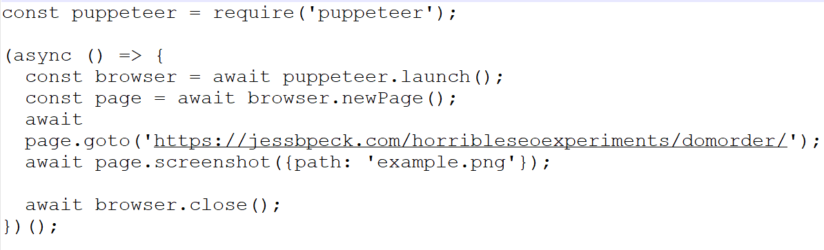
Puppeteer lets you, heh, puppeteer Chrome, headlessly, to look at pages. So you get to crawl the web with a Chrome based robot, a lot like Google does. You can do other things to make it more GoogleBot lite, even.
If code is too stressful to look at, you should be looking at the Mobile-Friendly test. In fact, I thoroughly believe most dev teams should build the MFT into their workflows. (At least, for SEO purposes).
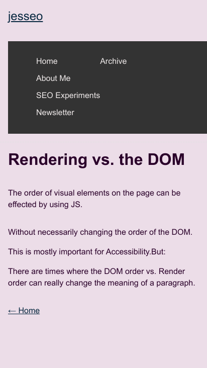
You can get this kind of screenshot from that-- but if you want to look deeper at a page, here’s a trick I like to use.
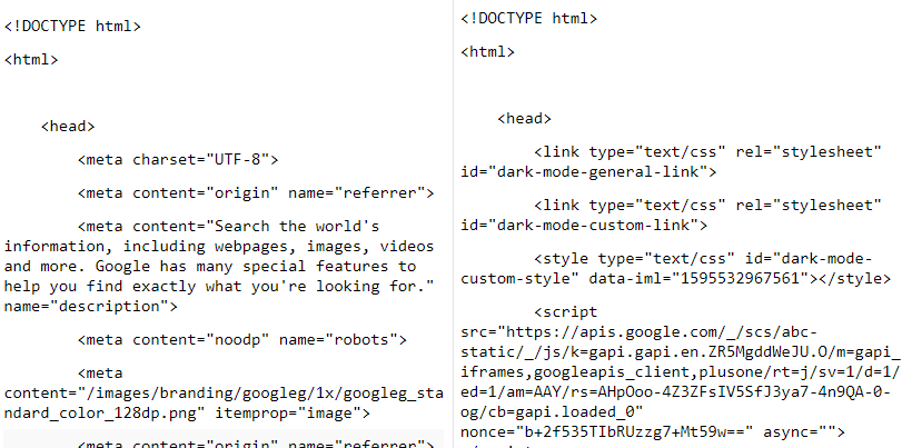
View the rendered HTML-- this is what the browser Google is using parses out, it is what Googlebot reads, even if it looks ugly to us.
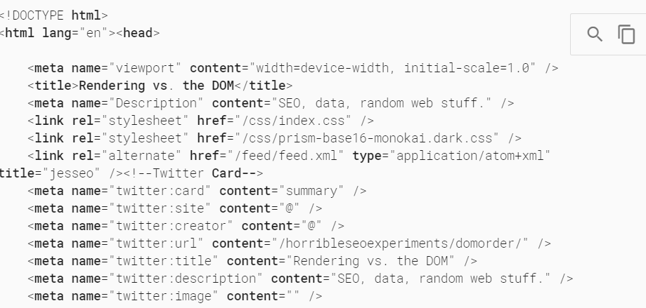
Press the two pages in the corner there to copy everything.
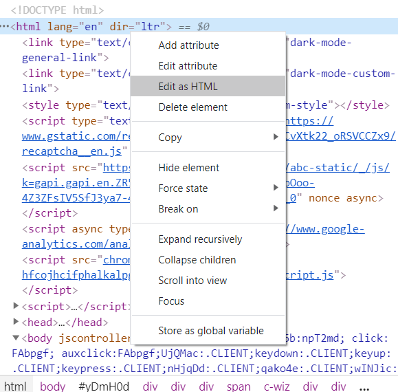
Open a new page, open the element inspector, edit it all as HTML, and paste your code in. Now you can even make tweaks and changes to fix issues.
Accessibility Tree + Screen Readers #
Some often made excuses for why you should pay attention to accessibility: someone could sue you for an inaccessible website, accessibility is for everyone, an accessible website is often good for SEO, there are plenty of nonpermanent disabilities that accessible websites help.
But even if none of that is true, you should care about accessibility because it’s the right thing to do. It’s another way to ensure your website is truly responsive, rather than stuck in one formation. I want to live in a world where accessibility is more important than SEO, because people with disabilities deserve to have easy access to the world around them. But we don’t live in that world, and a lot of clients would rather hire an SEO than an a11y auditor.
If you can encourage your clients to hire accessibility experts, please do-- there are tons of great folks on twitter to start learning, or hiring! (Adrian Roselli, Heydon Pickering, Eric Bailey, Sara Soueidan (who is more of an all around UI design system trainer), Stephanie Eckles, Sarah Fossheim, and more.)
But you can learn how to do first passes-- to understand a document’s structure from a screen reader perspective, to ensure users can actually get to the important links on a page, to avoid screen reader traps.
If you’re a mac user, you already have a screen reader! You can use Voiceover right now.
Windows users can download NVDA-- a freely accessible screen reader. I think being able to check your content is accessible to all users makes you a better SEO. WebAIM has a good beginners article for getting started with NVDA.
You can also look in the Inspector in a couple of different ways, to find the AOM and Accessibility tree:
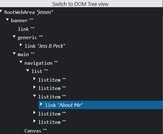
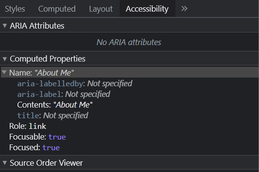
How to view the accessibility tree / how to look at the new Accessibility layout for the inspector
The DOM #
You should also be looking at how the page renders in as many ways as possible, as well as from different user-agent strings.
This gets back to the rendering conversation from earlier: the DOM is an API which can be used as a way of accessing the structure of a web page: it’s a representation of that page’s structure. We can access it through the inspector: an easy way is to plug some code into the console, like:
const y = document.getElementById("maincontent").getElementsByTagName("a");
Then, if you want to print it into a div with the id "demo" you could:
for (let i = 0; i < y.length; i++){

	document.getElementById("demo").innerHTML += y[i] + "<br>"


    };
Which would get all elements with the tag name “a” in “main content”-- all links in the main content. (And then would print them out into a bit of html with the id of demo, if you want.)
One of my favorite tools for this is “View Rendered Source”, which lets you not only compare the HTML and the rendered site, but also the same for Googlebot, mobile, and Googlebot Mobile.
The Search Object Model #
The main takeaway from this essay is in the conclusion, but there are a couple of other things I would like you to take away from this article.
One is that: you cannot rely on Google’s definition of responsive. Googlebot mobile-friendly is only mobile-friendly to Googlebot mobile, not to all mobile devices. The only way to user proof and future-proof your website is to make sure your structure is sound.
(We’re going to be thinking about can I use, and can I still use as well.)
Fifteen years ago, Flash sites were the hottest thing. Now Flash is dead. JavaScript applications are cool-- I love them, don’t get me wrong-- but relying on frameworks that might not be around in ten years is like building a castle on the sand. Treat Google as a specialized user. Write user stories for Googlebot, build Googlebot a persona!
Two is that: there is a hypothetical Search Object Model-- not an API, yet, but something that could be modeled out as an API in the same way it is for other object models. (Basically: I’m calling it this until someone tells me I can’t.) This is the object of the way your site is interpreted by Google, for users.
If browsers interpret HTML and CSS for websites, and if screen readers, smart fridges, laptops, and phones all do the same, then so does Search: it decodes the information and presents it to users, often not in a way that you expect it to be interpreted.
Your SERP is an interface, and Google’s code, and your competitors code, is all surrounding that interface. If we think about the entire SERP as an application, with different results as components: if we think about search from the perspective of crawlers having a specific tree, their own document that they refer to, we can get a much clearer view of what it means to interact with crawlers.
Google is an interface: Google is interpreting your code, like a browser, or a screen reader. And like a browser might display your site different to how you code it, Google might create a SERP out of your code that you don’t expect.
Conclusion: Why you should learn CSS #
This is my real conclusion, a stealth plea to my fellow SEOs, and also my fellow devs. Most of us know the value of JavaScript and HTML-- but for a long time, CSS has been neglected. CSS is considered “design”, but for the web, design is everything. We are designing information architecture every day, and CSS is a part of that. I have been able to speed up websites by using CSS attributes rather than JavaScript libraries, I’ve fixed rendering errors and accessibility errors by fixing a line or two of CSS.
Google hasn’t been able to judge design historically, but mark my words: Core Web Vitals is only the start of a new, design-focused era. And CSS is going to be a major component of that.
I’ve taught other SEOs HTML and CSS, and almost all of them have let me know, surprised, that they’ve used CSS more than anything. Once you know CSS, you avoid adding unnecessary JS, or mucking up your HTML to make things “look right.”
CSS is why so many struggle with Responsive Web Design: it’s why Googlebot occasionally chokes while understanding pages: and understanding it can be a real superpower.
So, uh.
Look out for my “CSS for SEOs” post, coming to a blog near you.
(thanks to @mtolander for reading through this and giving me some suggestions!)