The Almost-Complete Guide to Cumulative Layout Shift
Confession Time: I don’t care about the Core Web Vitals (CWV) update. #
For those who don’t know but still read my blog (hi, mom), here’s the quick rundown.
“Core Web Vitals” is the name of three “core” parts of measuring the “web’s” “vitality.” You can think about it as three scores that are attempting to measure the most annoying parts of a user’s day-to-day experience online.
The Core Web Vitals are as follows:
-
Largest Contentful Paint: when the Most Stuff shows up on the page, you want this to happen in less than 2.5 seconds
-
First input delay: time until you can Do Stuff on the site, you want this less than 100ms.
-
Cumulative Layout Shift: What we’re here to discuss today, so no spoilers.
Core Web Vitals can also be used to refer to the upcoming update-- at some point in ~May~ June/August 2021, Google will judge your Core Web Vitals, and if they are not up to snuff, they will cast you into the hell pits of page 2 quicker than Lil Nas X. Okay, probably not that dramatic. Big sites will still get away with having a bad user experience, but if all other things are equal, it’s good to have good CWV.
So the CWV update.
It’s just not pinging on my radar. We know sites have to be fast, and also, not annoying, right? I trust we all know that.
It's not going to be apocalyptic. Lots of sites are annoying. If Google stopped ranking annoying websites, we’d be forced back to Geocities and AskJeeves in no time.
However.
I do care about one element of the CWV update: Cumulative Layout Shift (CLS)
This is when stuff shifts around on a web page. There’s more to it than that- and that’s what this article is about.This post is an attempt to get the most comprehensive view of Cumulative Layout Shift: what it is, what it measures, how it measures, how you can see it, and how you can fix it.
Oh, also, I’m going to try and make it understandable no matter what your tech level is, and entertaining. We’re also going to do math and programming.
This is a long post.
TABLE OF CONTENTS HERE #
Why am I on this vengeance quest to create the most comprehensive Cumulative Layout Shift guide known to SEO-kind today?
It’s just because of this.
This twitter experience.
I keep clicking on hashtags instead of my friend’s twitters, and it’s driving me up the wall.
Twitter engineers, this is made specifically for you, so I stop doing this when my internet is slow. Please…. Please end my suffering.

Follow along at home! #
I’ve created a few web pages with some CLS issues here. And here.
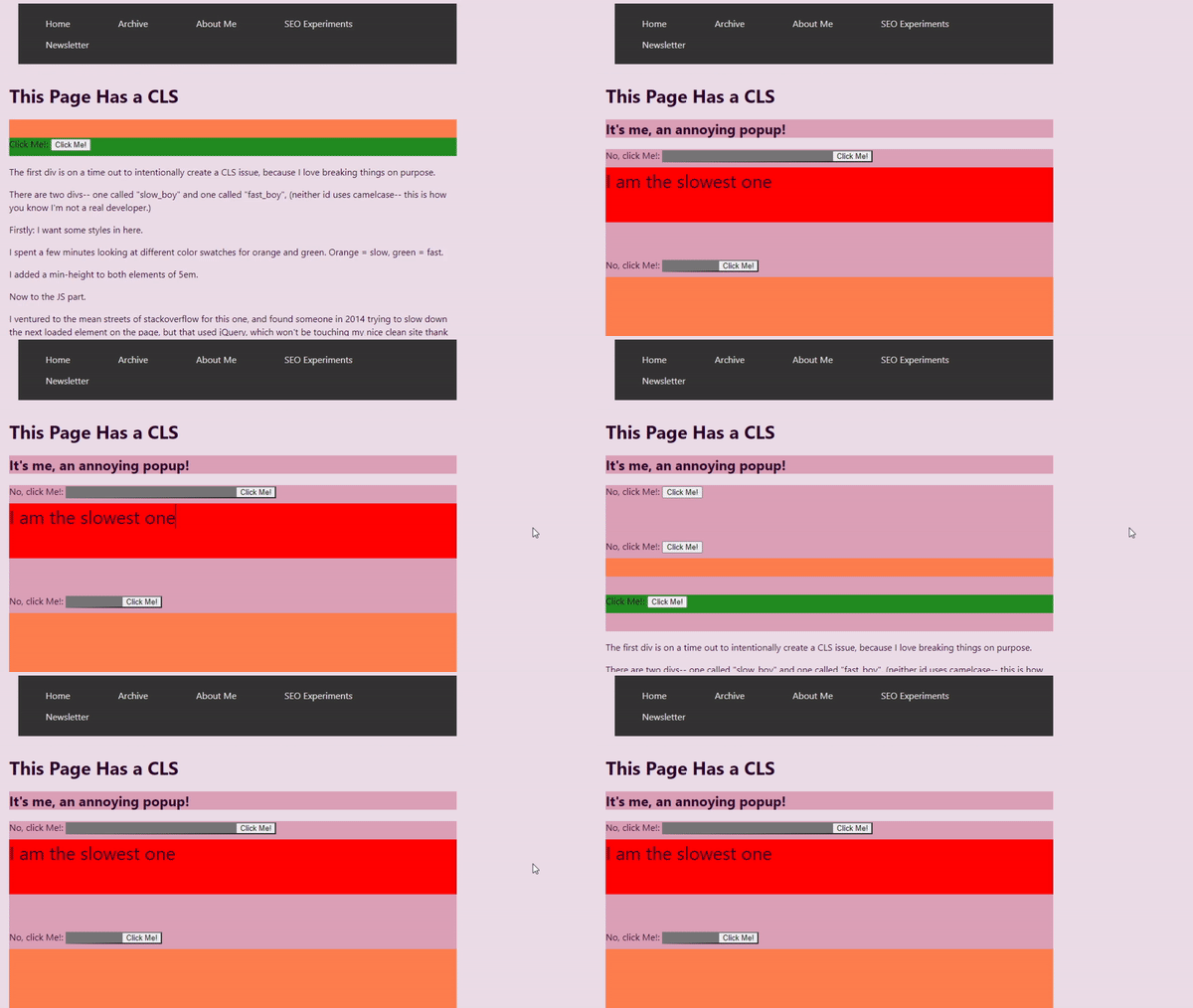
You can use these web pages to follow along and use the different tools and fixes along the way. I’m also going to detail the way I made these pages in case you want to create problems for your own website-- on purpose. I’m also going to have a big old list of resources down there, if this post was either too long or too short.
What is CLS? #
So let’s start with our most basic question: What is Cumulative Layout Shift?
From the name, we’ve got a pretty easy descriptor. CLS: it’s when your layout shifts around. Add to that the fact we’re measuring temporally as well as spacially and you get the “cumulative”: this is a measure of all the little shifts your website makes over a period of time.
Let’s step back one. CLS is when you’re about to click on a link, and the whole page shifts and you click on a different link instead. It’s when you’re halfway through a blogpost and an ad loads and you lose your place. It is when… the layout shifts. At least, that’s what it’s trying to measure-- both those shifts, how often they happen, and the irritation that causes the user.
So okay. You’ve got a new job. You’re a Google engineer, congrats, sorry about the San Francisco rent prices. You’re looking at this issue of irritation when stuff moves around on a page, and Keepers of the Algorithm want to start penalizing these annoying websites.

(Pictured: one of the keepers of the algorithm performing an algorithm update curse.)
Let’s take a very specific example: we want to eliminate websites where ads load later, and by doing that disrupt the user experience.
So how do you do this?
Well, first easy answer: you look at how much the page changes. If the page changes too much, you go to website jail. So you try penalizing sites based on how much they change. The problem becomes that most of the modern web is made up of sites that layer in different components over time. You don’t want to penalize sites for normal loading.
Another element is intentional Layout Shifting. Sometimes you need to check a user is 21 when they’re logging on to buy 4loko and firearms, and you don’t want to discourage sites from checking a user’s age/breaking the law. Or at least, you don’t want those optics.
So what do we do here?
Annie Sullivan’s “Understanding Cumulative Layout Shift” talk at the 2020 #PerfMatters Conference is a fantastic place to start learning about CLS, especially because they go into the decisions that were made while developing this metric. I’m basically going to summarize their talk here as best I can, but I definitely recommend giving it a watch if you’re interested.
Basically: CLS needed to be a way to quantify layout instability, which looked at how much of a visual area on the screen was affected. The area affected is the Impact Region.
A recipe for CLS: #
Dissecting our ad insertion case study, then: the content jumps because an advertisement has been inserted.
First: we identify all of the shifted elements on the page. If a thing moves, it’s a shifted element. Interestingly, the advert that gets inserted isn’t a shifted element-- it didn’t exist in the previous frame. We don’t want to penalize people inserting new elements, remember that’s how almost all websites work nowadays. Progressive rendering is the way a lot of websites work, and that’s rendering web pages a chunk at a time. We want to measure elements that already existed and moved to a different location.
Second: we combine the new visual area with the old. We look at the union of the before and after state of the visual area. The combined impact area is called the impact region. We have to compare this with the viewport-- the size of the screen that the website is being loaded on. Why? Well, if there’s a teeny tiny change on a big desktop screen, that probably isn’t going to have a big visual impact-- but if that tiny change happens on a mobile screen, it’s a lot more annoying.
So three: we compare this with the viewport.
Time for the first part of our math equation:

So the amount of area that has been impacted by movement divided by the area of the viewport gives us an impact fraction.
The first prototype of CLS only looked at the impact region and didn’t capture the movement distance. So a 10 pixel image that moved 30 pixels was “less distracting” than a 40 pixel image that moved 5 pixels. This caused some issues. A large element might just move slightly and “click into place”, but would be penalized more than a button zooming around like the ball in pong. Adding the viewport consideration to the metric helped fix that.
Let’s get to the second half of this equation: move distance. How far did any shifted element move?
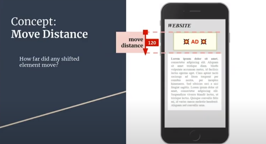
We do the same thing here: compare that with the viewport, and we have the distance fraction.

So we have these two equations: one measuring how much of the page is impacted, and one measuring how far the shifted elements moved. Surely now we have the CLS score, right?
Well. Kinda.
We have the LS score-- the Layout Shift score.

But it’s not Cumulative yet-- because these changes are happening over time. The LS equation above is just a single moment of time in the browser session.
You add all the LS scores for all the animation frames and you get CLS, the Cumulative Layout Shift score.
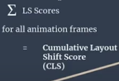
That E thing means do the same thing a bunch. So you do the equations over and over for each animation frame as the layout shifts.
This score is rated from 0–1, where zero means it’s stable and 1 means the most shifting. In Google reporting for _aggregated _CLS they use the lowest common CLS for 75% of visits to a URL in the group.
CLS is a measure for a robot to approximate the user perception of instability. This means we’re getting a unit of change over time. It’s a three dimensional equation, and there are tons of things that can affect it. For example:
Interactions: #
Okay, this is all well and good for our “intrusive advert” problem. But this isn’t going to solve my “accidentally clicking on the wrong twitter thing” problem. That’s a problem of interaction, not just loading.
And, on the other hand, we don’t want to give a page a bad score just because the user made changes on the page.
The Naive-- that is, gut-- solution might be to ignore CLS that happens inside event handlers. That is, you ignore layout shifting if an event has been triggered, say, by someone trying to click something. Rendering can, however, change asynchronously (out of beat) with user input, and it’s hard for a browser to trace that the shift is because of input or not.
So there’s an interaction exclusion zone. CLS ignores layout shifts that happen within half a second of input. That means if the annoying twitter CLS issue happens more than 0.5 seconds after I interact with the page, it counts as a CLS issue.

Digging into Windows #
While we’re here, let’s dig into the “Session Gap” metrics around CLS.
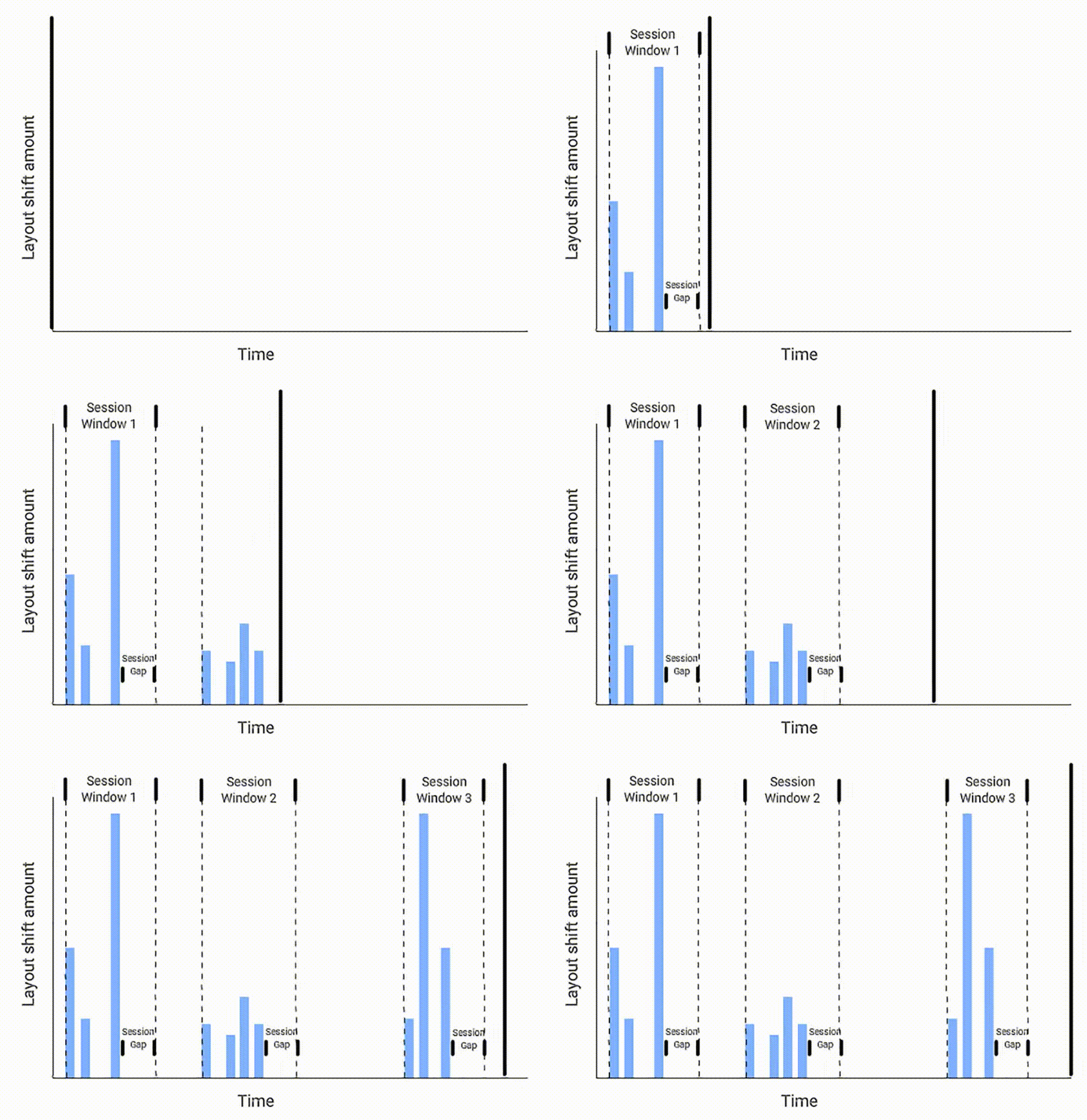
Google is still working on CLS as a metric. This is because it’s not an easy thing to measure-- you’re trying to measure a subjective experience with objective math, and it’s not something you can easily robot your way around.
What we’ve talked about so far is mostly information from 2020. This is where I’m going to go into some of the more recent developments in CLS.
The Chromium team tested 145 different metric definitions based on different permutations of windowing strategies. Windowing strategies means something in marketing/legalize I think, but here it is referring to the approach of looking at layout shifts. These are ways of grouping shifts into clusters. Elements can shift multiple times as new content moves or loads, so they use these windows to group shifts together.
-
Tumbling windows
-
Sliding windows
-
Session windows
With tumbling windows, you break the page into equal sized chunks based on time, like a quarter second chunk at a time. Then everything that moves around in that quarter second is all part of the same tumbling window.
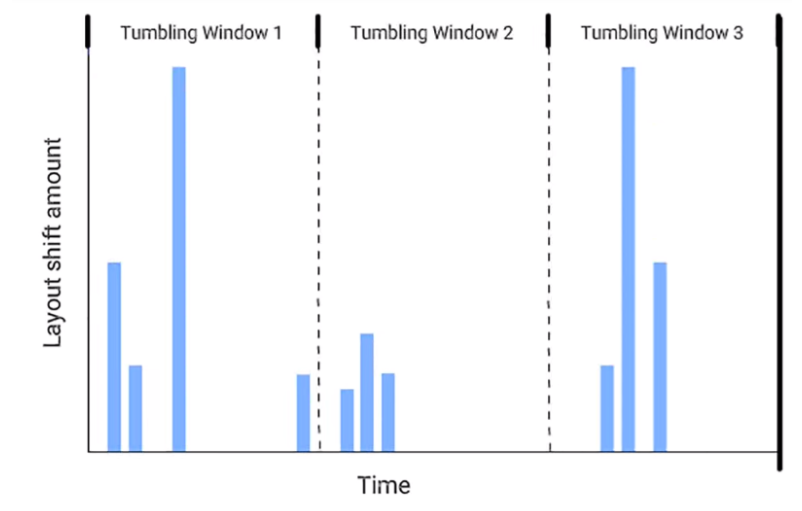
So in this one: that second cluster of actions seems like it’s in the same window, but is split between window 1 and 2 because the timing is fixed.
Sliding windows is another way to look at this kind of metric. You continuously update the potential window over time. Think about it like almost a panorama of actions taken that you can zoom in on.
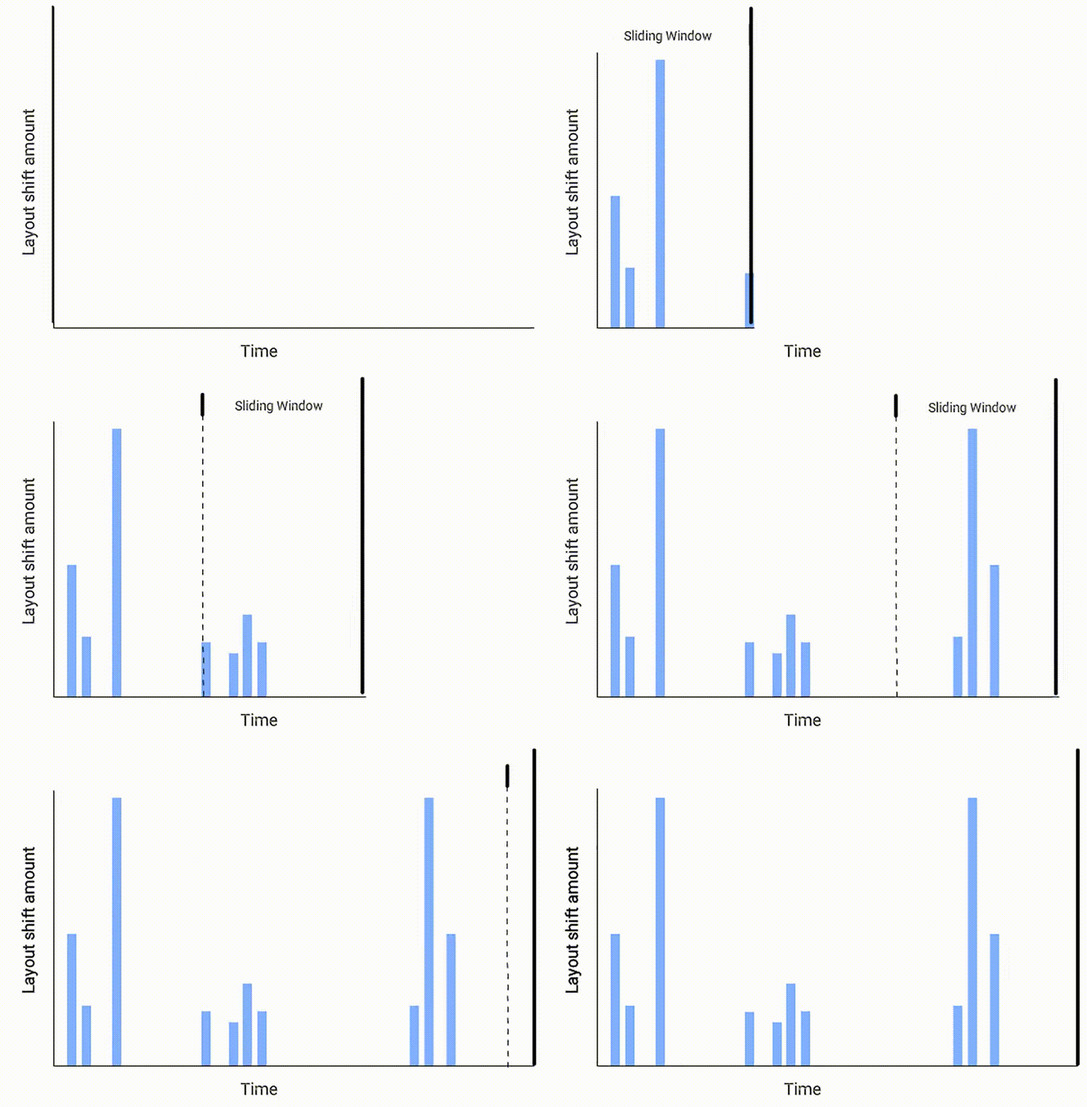
The final “window” we’re looking at are session windows.
This method is interesting - it’s automatically sorting movement on the page into clusters: so a movement begins, and grows the window until there’s a gap. You can think about this method being a bit like the kids game “keepy uppy”-- the shifts are keeping the “ball in the air”/the window open, and then when the ball hits the ground-- the shifts stop for a period-- that’s the end of the cluster.

Why are we talking about these three methods? Well, I think it’s interesting to build out the philosophy and ideas behind this kind of metric. And because, due to feedback, the plan is that CLS uses session windows: the maximum session window size is 5 seconds, and sensing no movement for 1 second ends the window.
Now that we know we’re measuring by session window we can calculate a CLS for the page. Google considered two summarization strategies:
-
The average score of all session windows (with different session metrics: the windows were longer, with longer timing)
-
The maximum score that one of the sessions got (with the small session windows-- the five second max, one second gap ones.)
They went with the maximum score, because, well, averages are weird and can be misleading. The idea is more to alert devs to a problem area, rather than be a perfect measurement of how annoying a page is.
What this means is that CLS as measured in Lighthouse isn’t actually a cumulative measurement anymore. Ben Schwartz has suggested that Lighthouse should rename the metric as reported there to “initial Layout Shift” to differentiate between Lighthouse CLS, and CLS reported by other tools like CrUX.
If you’re interested in this topic further I really recommend reading this web.dev post about it.
So CLS is an incomplete metric.
It can’t give the whole story-- and it’ll change definition over time, like every score, as it figures out what is good and what is bad for the web. (And Google.)
Why does it matter? #
Getting down to brass tacks, I’m more interested in CLS as a metric from a tech and web dev standpoint than a user standpoint. I’m not the person to go to when you want to convince management to take a tech SEO thing seriously. Once I said we should create a PWA “because it would be cool.” This is why we lean on other people’s writings.
So here, I’m going to lean on two other studies of Core Web Vitals generally and CLS in particular. So here’s some stuff to send your stakeholders.
- Users don’t like bad CLS
Most of these stats I’ve stolen whole cloth from this SpeedCurve study. But let me tell you, folks, users don’t seem to like sites with layout shifts very much.

Some notes from this study:
- Conversion rate drops as CLS score degrades
- All sorts of things can happen to bounce rate with CLS score changes
If you want, you can just share the charts that say “a bad CLS score seems to make users sad” and leave it at that.
Another little bit of data comes from SEOClarity (disclosure; I’m friends with Mark Traphagen, and he works there. But also I don’t have the time to look at 1 million websites.)
- From over 1 million websites, we found that 95% have a ‘Good’ CLS score.
- This means, on average, 5% of sites’ rankings will likely be negatively affected by the Google Core update relating to CLS, which could mean an estimated $205.25 billion (5%) of ecommerce revenue affected.
- The Core Web Vitals Google algorithm update will affect more websites due to poor CLS score (5%), than websites that have poor FID (3%) and LCP (2%) performance speeds.
So what does this mean? If 95% of websites have a good CLS score then you’re probably fine, right?
Not quite. That means right now 95% of those sites might be doing better than you. And it’s a snapshot of time-- again, this ranking factor is likely to change over time. It’s likely to get more expansive (covering more of a page) and more specific. So the time to understand and get on top of CLS is now. Especially with the knowledge that this is the first metric that attempts to measure UX in this way. It won’t be the last.
So if 1 is Users Don’t Like it When Your Layout Shifts, 2 is Even if they Did, Google Doesn’t, so improve for SEO purposes.
I’d recommend reading The Science Behind Web Vitals, from the Chromium blog.
“A more serious consequence is that unexpected layout shifts can lead to errors. If the user is trying to tap an element that then moves, they may end up tapping something else that moved into its original position. This is because the delay from perceiving the shift, deciding to abandon their action and then doing so can make it impossible for a human to respond appropriately. This could mean clicking a link or ad or "Buy Now" button unintentionally and significantly disrupting the user's intended journey.”
Measuring CLS: #
So we’ve know what CLS is, and why it’s important. Now let’s get around to measuring impact. We’re going to be using this page to demonstrate all of the different ways to measure CLS score, so you can follow along at home.
Lighthouse: #
Lighthouse is an automated audit service coming to you from Google. It’s a great place to start if you’re a solo broke webmaster who can’t read every article about every web thing. There are a couple of different ways to run Lighthouse, and you can find those in this post. I’m going to be using the Chrome DevTools version for this. Right click on your page, open up devtools, and hop along to Lighthouse. Generate report. You’re done. Easy!
One thing to note: it seems like Lighthouse only really measures CLS when it’s a CLS above the fold. This means CLS is being measured at the top of the page, and not all the way down. This might be an obvious thing, but it caused me no end of frustration when I was trying to make my bad page.


Because the only part of the screen that’s moving around is that tiny bit at the bottom, we have a “technically good” CLS score. I can’t believe this is the thing that forced me to update my website.
Also, I can read, okay? I just figured the bouncing around at the bottom of the screen would be bad enough to register.


So this is a pretty good place to get that CLS score we were talking about earlier.
We’ll be coming back to DevTools in a bit, but the debugging there only gets more complicated, so we’re going to try some less technical ways of measuring CLS first.
A Detour into Bulk Lighthouse Scripting #

(Bülk Lighthouse, not bulk Lighthouse)
I just also want to dip my toes into the “what if I want a lot of these scores” end of the spectrum. If you like a little NPM, a little JavaScript, you can use the LIghthouse Batch Reporter via NPM.
It’s got a pretty easy install and run process:
npm install lighthouse-batch -g
lighthouse-batch -s https://www.jessbpeck.com,https://jessbpeck.com/horribleseoexperiments/clsyes/
Which gives the following result:
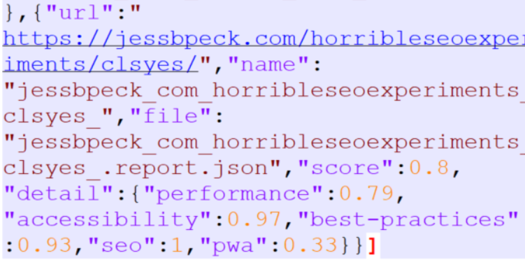
Ugly. But effective! I also would 100% recommend this article by the fantastic Ruth Everett with better info on how to use Python to measure Core Web Vitals.
Core Web Vitals Browser Extensions #
These are some neat little tools if you hate your competitors.
First we’ve got the Core SERP Vitals tool from defaced.dev. This shows off the Core Web Vitals scores of websites right in the SERP. Obviously this article is all about improving your CLS, but the Core SERP Vitals extension can show you if you’re going to have a competitive advantage.
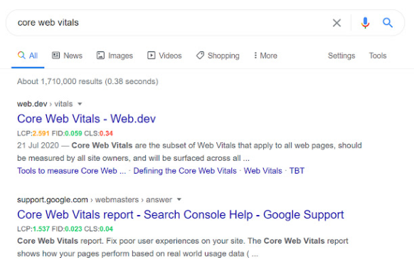
One thing I think has been undervalued in circles talking about Core Web Vitals is the Jess Factor, which is the factor where you’re pandering to me, Jess. And I will bounce off your website faster than a speedball of Serena Williams’ tennis racket if there’s a hint of this shifting around nonsense. I’ll turn off JavaScript. I’ll copy the HTML and delete half the files. I will. Don’t test me. So, you know, make Jess-as-a-User happy and do good on your Core Web Vitals. I’m gonna guess people will be able to see their bounce rates go down by doing this.
Another good extension comes from Addy Osmani, Engineering Manager at Chrome. This is the Web Vitals extension-- all it does is measure the CWV metrics for a page. It’s consistent with Google’s other tools, and provides a detailed drilldown as well.
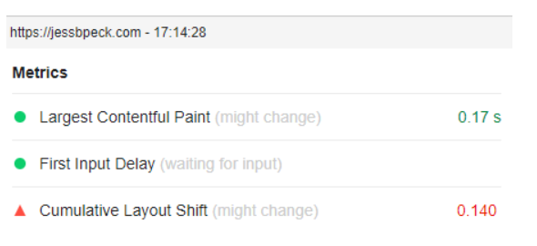
The really fun nerdy thing about this extension for the types of people who like to read source code is that the source code for this thing is all up on GitHub. This means you can see how they’re measuring the Web Vitals, what updates get made, and you can even fork it yourself and add your own code.
This one doesn’t have the patented Jess Peck Choice award because it came out like, today, and I haven’t used it extensively., but it’s a neat enough tool for people who prefer extensions to other tools.
Search Console #
If your site is big enough, Google will send you user data for Core Web Vitals in Search Console. I don’t get enough visitors a month to trigger this, so embarrassingly, I have to use the Google screenshot instead of making my own.
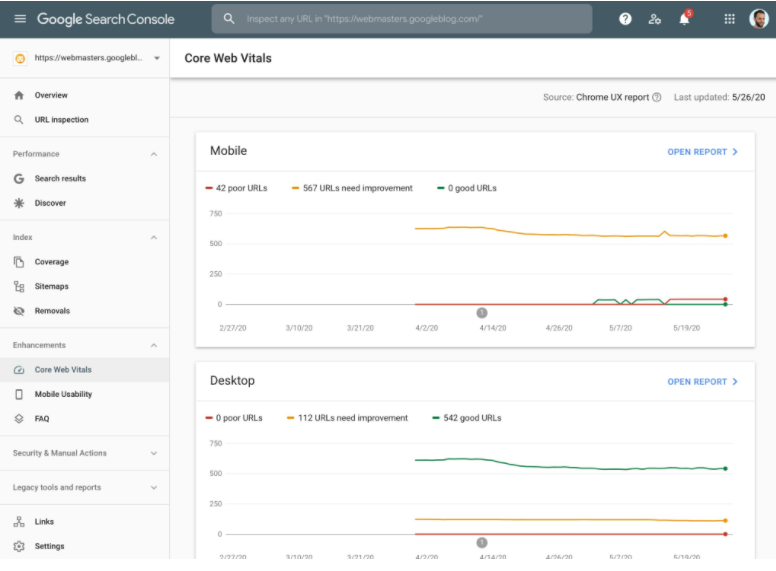
If you’re maintaining the CWV for a large site, this can be a really good place to at least monitor where Google thinks you’re not, ahem, measuring up.
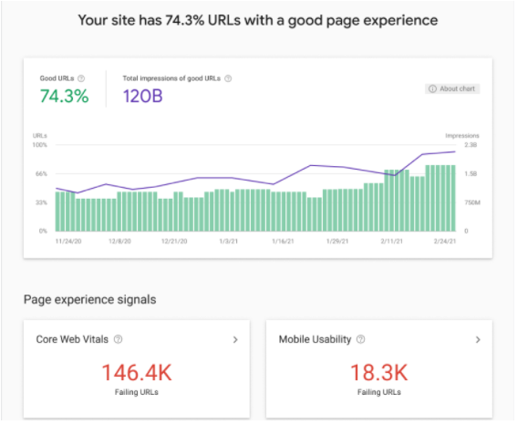
There’s also the new Page Experience Report that literally came out today while I was editing this blogpost so now I Have To Include It, because this is supposed to be comprehensive. But I haven’t actually been able to use it, so I’m just gonna link to the Google post about it and put a screenshot here.
Lighthouse Scoring Calculator #
This isn’t fully CLS, but it is another useful little CWV tool. This is more about understanding how Google constructs the final Lighthouse score.
The Calculator has the name of the metric, how many seconds it takes/what the calculated value is, what the metric score is, and the weight. CLS is waaay at the bottom-- and is, uh, weighted a lot lower than the rest of the metrics.
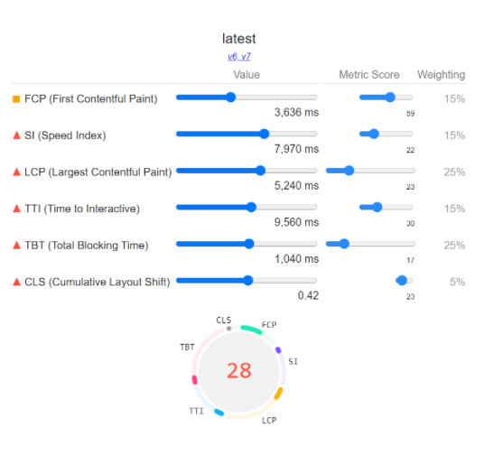
And building based on the Lighthouse score our bad page got earlier:
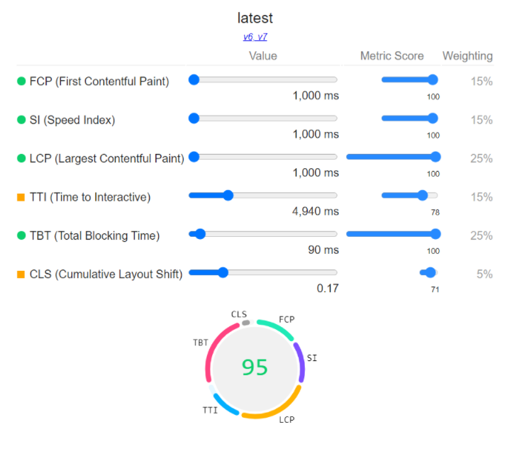
Learning is fun, folks.
WebPageTest + Frustration Index #
Two great tastes that go great together.
The WebPageTest by Catchpoint is a web performance tool for diagnosing info about how a page performs. It’s really useful for devs and SEOs. So let’s just plug our horrible website into there.
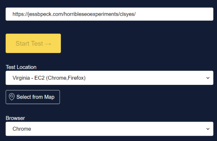

This is a big scary looking page, but it’s just full of all sorts of useful little tidbits. I really like the filmstrip capability:
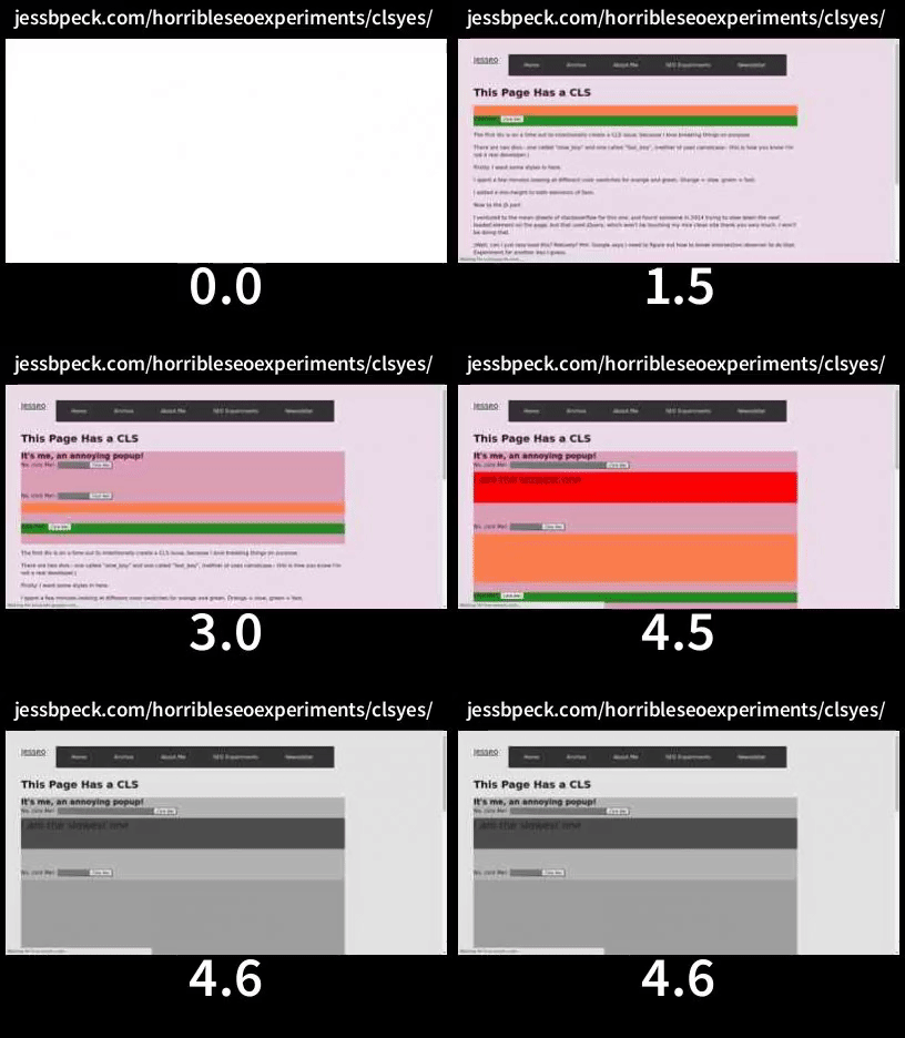
This also includes the ability to see when shifts happen.
Tim Kadlec of WebPageTest wrote a roundup of the tool and the CLS metric that you can read here. He also talks about some of the problems with CLS as it stands, some of which we’ve seen before in this very blogpost.
But the really fun thing you can do with the WebPageTest is you can take the URL of your test and plug it into the Frustration Index.
Now as someone who is always trying to frustrate users as much as possible, this is a great resource for me, because it shows me where I’m missing. For example, despite being utter garbage, this page only has a “mildly frustrating” score per the FRUSTRATIONIndex.
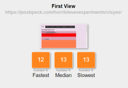
Still, I’d definitely recommend playing around with these tools. See how frustrating you can get! Or the opposite, if you actually like your users.
(Additional reading: Measuring Cumulative Layout Shift (CLS) in WebPageTest)
DevTools 2: But Harder #
Let’s say you’re beyond the Lighthouse now. You want to get into the meat of CLS, in DevTools, just like a real developer would. You’re in great luck! It’s easier than ever to break things in DevTools, and I’m going to show you all the ways how.
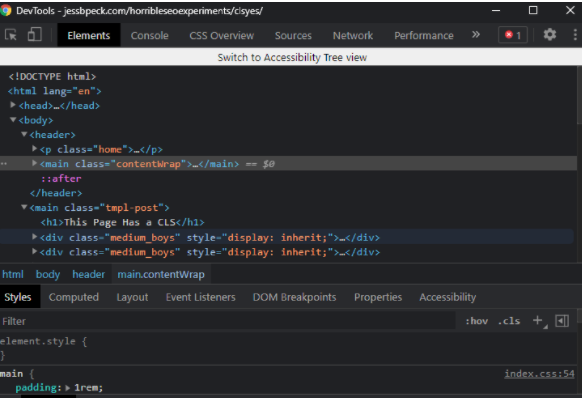
My devtools looks different to yours, because I’ve enabled a bunch of stuff and also darkmode.
The first thing we’re doing today is recording performance. Go to the performance tab and hit ctrl+shift+e. Oh and tick that little Web Vitals tick while you’re here.

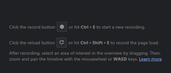
Here’s some Good Performance Tab Reference.
Let’s break down this DevTool by layer.

This is basically “stuff that happens over time”-- it’s a timeline of activity. DevTools automatically zooms in on the bit of the timeline with the Most Stuff Happening.

This is the cool looking cyberpunk stuff little me dreamed of. This is our Tasks and the Core Web Vitals. Those little red dots? Those are layout shifts. (The green dots are CWV metrics we're succeeding at.)
So let’s zoom into that.

My whole DevTools window looks like this:
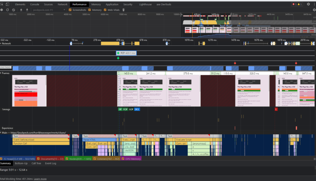
But we’re going to focus on that second visible red dot in the Network section.
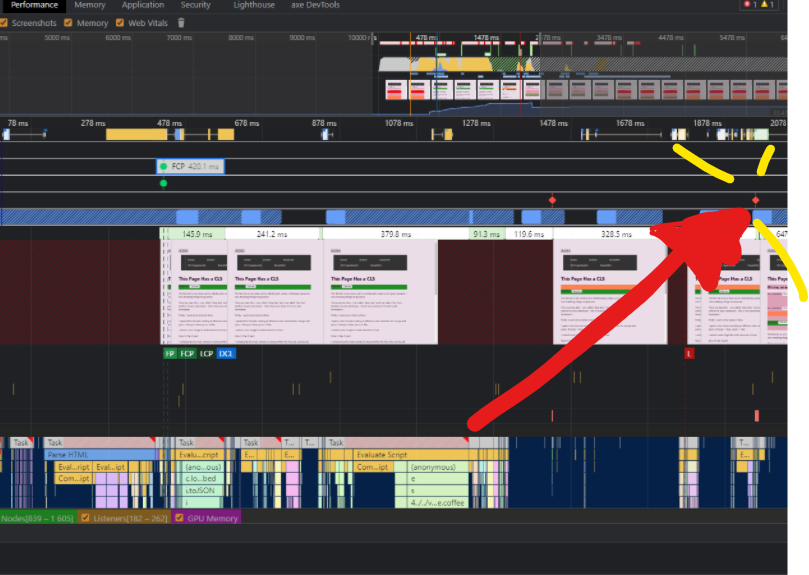
And zoom in...
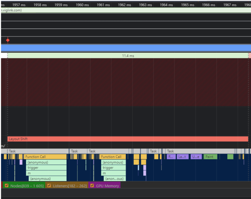
See that big long “Layout Shift” bar? If you hover over it, DevTools will highlight the offending element on the page.

This lets us get down and dirty and identify shifty elements.
Then you can open up the summary, which shows you all the places that element has moved to and from, including their names.
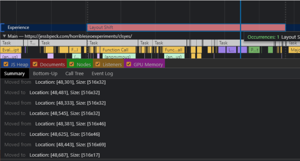
This is a really good article that goes more into this method: How To Find & Fix Layout Shifts with Chrome DevTools
Gif Generators: #
Let’s get into Gifs! Everyone loves them, and I especially find that a good Gif can help illustrate concepts for higher ups when they might otherwise think their site is perfect. Especially when the gif has a bunch of red stuff all over it.
My friend and mortal enemy Chris Johnson (aka @Defaced on twitter, give him a follow) put together this Gif building tool. The beauty of this tool is you can use it both through the interface:
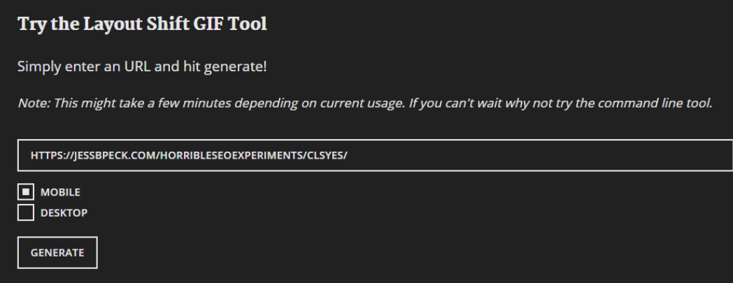
And, if you’re feeling a bit nerdy (and if you’re on this web page, you probably are?) You can use NPM to try it on the command line.
npm install -g layout-shift-gif
layout-shift-gif --url https://jessbpeck.com/horribleseoexperiments/clsyes/ --device mobile --output layout-shift.gif
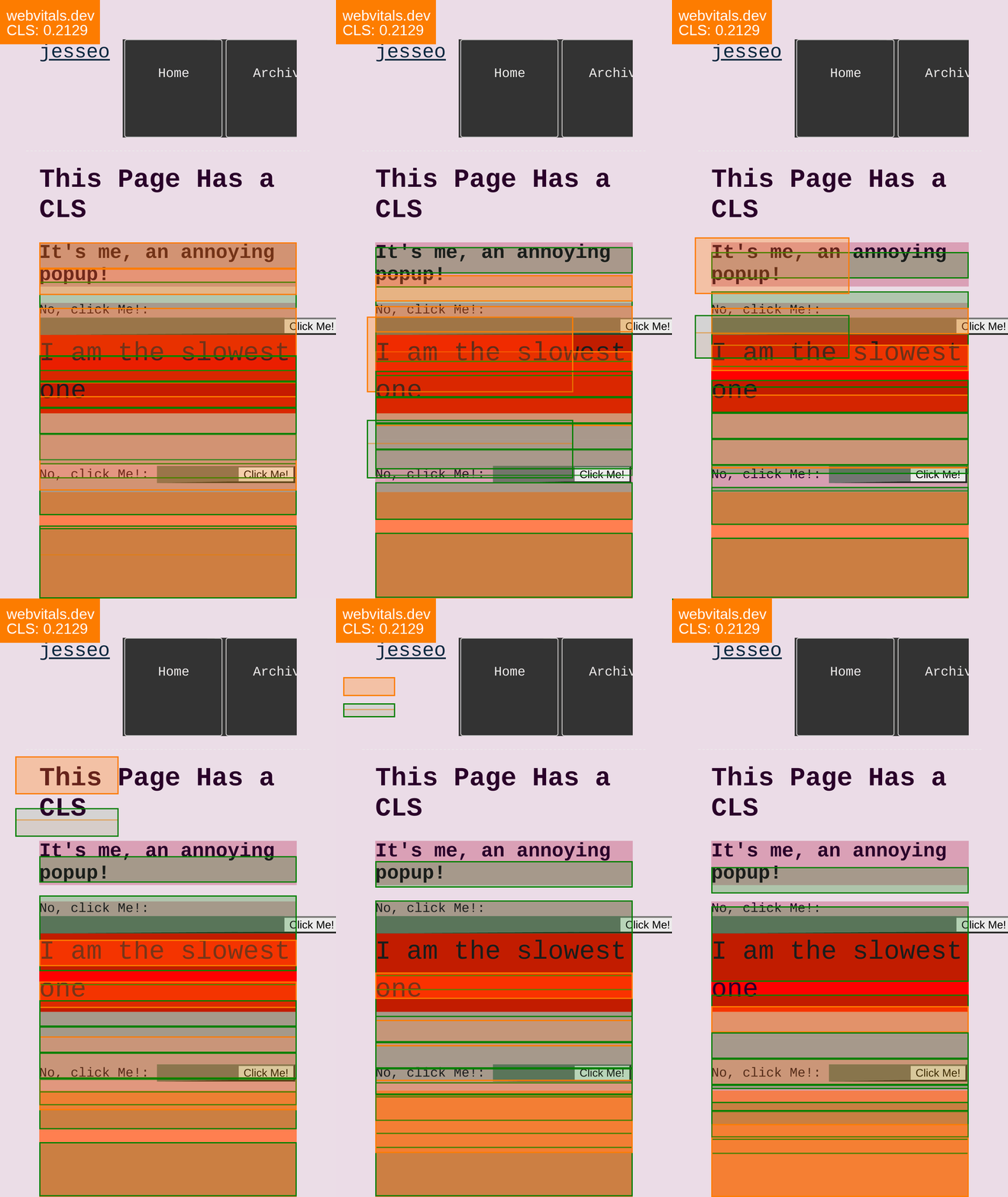
You can also run over to webvitals.dev for a different kind of gif.
CrUX and RUM #
The tools that we’ve looked at so far measure CLS synthetically. They aren’t based on real users. CrUX is based on people-- RUM, or Real User Measurement.
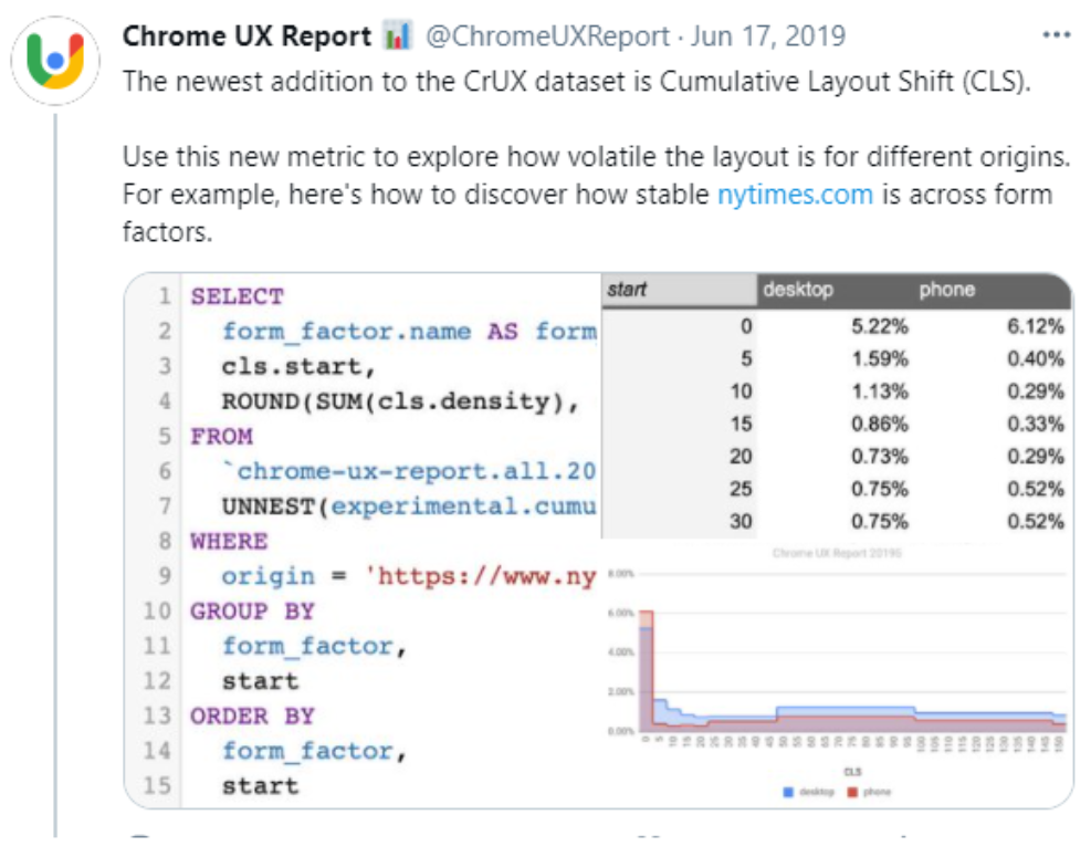
CrUX added CLS to its dataset in 2019. This is the data you can see in the Search Console, but sometimes you just need a bit more data. Enter CrUX. There are two major ways to look at this data outside of GSC or PageSpeed Insights.
- Public Google BigQuery project, which aggregates user experience metrics by origin
- CrUX Dashboard on Data Studio
If you’re querying CrUX with SQL, you can use this kind of query:
#standardSQL
# This query only processes 117.5 MB because it uses the materialized dataset!
SELECT p75_cls,
small_cls AS good,
medium_cls AS needs_improvement,
large_cls AS poor FROM
`chrome-ux-report.materialized.metrics_summary` WHERE yyyymm = 202103 AND origin = 'https://jessbpeck.com'
Here’s a decent dive into using CrUX.
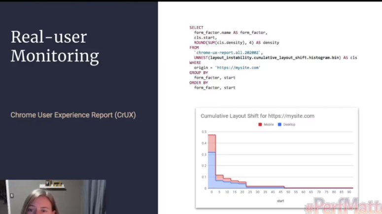
One day I’m going to write a post about RUM and creating your own user monitoring, but today is not that day (this post is long enough already.) This Mozilla article is a good starting point for learning about the difference between RUM and synthetic monitoring though. I’m also going to recommend Nic Jansma’s in-depth article where Jansma goes into all sorts of RUM reporting options, including building your own and using an open source JS library.
So you have your tools. Use them wisely.

A Small Dive into the Layout Instability API - W3C Draft #
Before we start actually fixing the problems I’m talking about here, I want to do a deep dive into the draft of the Layout Instability API. So that means I’m going to have to explain three things to you, my dear audience: APIs, W3C Drafts, and the specific Layout Instability one of these.
rubs my temples primary sources….
First: what is the W3C? They are the World Wide Web Consortium; the grand poobahs of the internet. They make sure the internet is standardized, accessible, and not shitty. They exist to avoid what we call “the browser wars”-- because everything is standardized, and there aren’t any monopolies (cough), you can see websites on basically any browser.
They do this through a system of drafts and standards. W3C has a set of standards that browsers need to abide by. But sometimes, an engineer at like, Netscape has a really good idea for a new feature to be built into browsers. This can be an API, this can be accessibility/ARIA, new HTML, all sorts. But we don’t want a browser running off with a bunch of features that other browsers can’t use, especially if it turns out the new feature is bad for users/accessibility/the Web. So developers have to submit a draft, saying basically, this is a feature, we think it’d be cool, pwease W3C let us run wild with it.
And eventually W3C says “sure” or occasionally “no this idea is bad and you should feel bad.”
Okay, thing two: what’s an API? We’ve used them already in this talk, and the word gets bandied about a lot. I think most SEOs know it as “the thing Ahrefs provides that lets us get a lot more links for some reason.” Off the top of your head, you’re probably thinking about APIs in terms of data. But it’s more than that!

API stands for Application Programming Interface: it’s a tool that allows you to access part of a program or data from an app or OS or program or whatever. A Web API is an API that is built into the WEB-- something that people can access easily using HTTP protocol.
An example of this is the Geolocation API, which means you don’t have to reinvent the wheel every time you want to Geolocate something.
Browsers will ship stuff before they’re fully approved by W3C-- I like the twitter account IntentToShip to keep an eye on them.
Finally: let’s talk about the Layout Instability API. #
The Layout Instability API is the enchilada that CLS is based on. From the draft, “This document defines an API that provides web page authors with insights into the stability of their pages based on movements of the elements on the page.” It is currently an unofficial W3C draft, but it’s also exposed-- you can use it.
This API allows you to break down your CLS in detail. The Layout Instability API reports layout-shift entries any time element changes its start position within the viewport. It also generally reports on unstable elements (my eighth grade nickname.)
The API does a few things different to the metric that’s reported in LIghthouse etc. For example, the API doesn’t look inside iframes, and for another issue, CLS is supposed cumulative-- you have to make the JavaScript API look at the period of time rather than just a few frames.
So there are all sorts of ways you can use this. For example, you can plug this little bit of sample code into the console tab in DevTools:
let cls = 0;
new PerformanceObserver((entryList) => {
for (const entry of entryList.getEntries()) {
    if (!entry.hadRecentInput) {

      cls += entry.value;

      console.log('Current CLS value:', cls, entry);

    }
}
}).observe({type: 'layout-shift', buffered: true});
And see a little LS.
This isn’t yet a full grown API-- but it’s useful for testing, and I’d keep an eye on the spec to see if that kind of measurement evolves further.
CLS Problems (and solutions?) #
Now we’ve done the math, we’ve read the blogposts, we’ve seen some graphs, done some JavaScript, and made some gifs. There’s buy in from the A, the B, and the C-suite. It’s time to fix our CLS issues. The only question is… how? This section is going to cover some of the most common CLS issues I’ve seen and the fixes that you can implement, or others have suggested, as well as going into the future of CLS.
Home stretch folks. Thanks for reading thus far.
Carousels: #
Some sites with image carousels had high CLS scores-- they use JavaScript or CSS to automatically advance along images.
CSS lets you animate any property you like, and if you animate the position property then Chrome/whatever is rerunning the browsers layout engine on _every animation frame. _This means every frame produces a layout shift, and even if it might be small for each frame, the cumulative score will grow and grow. Think about it in terms of the math we talked about above: a movement shift, a movement shift, a movement shift, a movement shift, and we add a LS, LS, LS, LS….
So we have a two-fold solution. On the Chrome/browser end, CLS does ignore changes to the transform property: as long as the carousel uses transform animations, you won’t get penalized. In keeping with the idea of punishing layout instability-- since transform doesn’t mess with the layout, unlike position.
Transform is also easy to update off thread and doesn’t paralyze the rendering of the page. The page will be more efficient and responsive.
If you have a carousel, you should use transformations and make sure it’s accessible as well. I’m going to sneak some accessibility information into this blogpost: your carousels should be structured, functional, and readable by everyone-- and users should be able to stop and resume the movement. Doing that last step will go a long way into fixing any CLS problems your site might have, especially if you start the carousel on paused.
But also you probably don’t need a carousel anyway.
Images: #
Visual search is super important you guys, but images are also a major source of bad-website-disease. But better things are possible.
The general good advice for SEO and images is like this: have compelling high quality images, use large images with the max-image-preview:large setting, but compress the images that show on the page. Write good filenames and alt text.
But here’s the (not so) new super important thing for images: always include your width and height size attributes for your pics. You can also use the new aspect ratio CSS attribute to reserve the space, avoiding images awkwardly moving things around. There are tons of tools to calculate aspect ratio, like this one here.
Modern browsers actually set the aspect ratio of images based on an image’s width and height attributes, so it’s good to set them, since that reserves the space for the image to render. User Agent stylesheets (the default stylesheets of a browser, I’ll get to them more in a minute when we talk fonts) actually add a default aspect ratio CSS element based on the existing attributes.
img {
 aspect-ratio: attr(width) / attr(height);
}
This means you can actually manipulate this element. You know. If you wanted to. This is one where I’m heavily leaning on doing as I say, not what I do, because my site is very fast. Like all would be developers I love to brag about how my site is pretty fast.
Fundamentally, though, you should be using srcset for images. Google likes huge images, browsers get weighed down by them, and srcset is a way to make everyone happy.
Did you know there’s a python library for finding information about images, including their size? MIght be useful.
Fonts: #
I’m 28 years old, and it’s time for me to get into the plagiarism business. As such, I’m cribbing a ton of this info from this well researched, fantastic article from Simon Hearne. Fundamentally, if your fonts are moving things around, there’re plenty of ways to stop them from doing that.
If you don’t spend a lot of time building websites, you probably don’t realize how much of a pain fonts can be. You can spend hours of time picking out a good font, only for it to be huge or ugly or weird or all sorts of things. One thing I do on this very site is I use browser fonts for speed (I even have a Chrome extension for myself that strips sites of font styles, please don’t tell the typography nerds. It just makes things a lot faster!)
There are two major reasons fonts cause layout shift:
-
The fallback font gets swapped with a new font (it’s Times New Roman until enough of the page loads and suddenly it’s comic sans)
-
“Invisible” text is displayed, then the font gets rendered
One thing Hearne points out in his article is that you can just use:
font-display: optional
To both speed up your site and avoid the Layout Shift Problem. That little CSS snippet tells the browser “if the font we want is late to the party, don’t let him in”-- if the font shows up after the text needs to render, don’t use the font, just use the system default. Give it 100ms. Optional is the only way to avoid layout shift. But, uh, you might not want to use system fonts. Especially if you’re one of those typography nerds from earlier. What are some other solutions?
-
You can load fewer font files! Most fonts come with a ton of different files-- minion pro, minion bold, minion bold italic, minion bold italic underline strikethrough-- and what you might guess is you don’t actually need to load all of these, and you can instead fake them. People who care about fonts will notice, but they’ll also get a faster, cleaner experience.
-
You can also do the usual sorts of things people do with other files when they want them to load faster.
- That is, you can use more modern formats (like woff2), cut out unnecessary info from the files, preload font files (you only have so much preload space, so be careful with this), cache your fonts, and host them on your site rather than telling browsers to go check out Google fonts and get back to you.
Ryan Mulligan also put together a good CodePen on how to mold on hover without moving things around. (Which, again, my site does. Whoops.)
Layouts: #
Here are some FUN things that you can use to boost layout stability and speed.
content-visibility is a new CSS property which allows you to delay the loading of stuff that isn’t in the user’s frame. So if you have a bunch of heavy images just off-screen, you can avoid loading them until they’re needed. It really helps speed up your site-- in this ep of HTTP 203, the lads use it and take the layout time of a page from 50 seconds to 400ms.
It is bigtime Chromium, though, so if your users don’t only use Chromium browsers you should make sure there’re fallbacks and everything is put together properly.
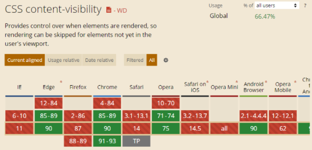
One thing to note with this solution is the accessibility angle. This API hides things from users when they aren't on that part of the screen-- but screenreader users might not scroll at all. Content visibility:auto causes problems for screenreader users-- so it's better to use content-visibilty: hidden.
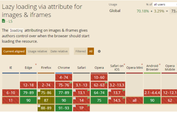
Lazy-loading is also getting there-- this is specifically for things like images, iframes, etc. You identify non-critical resources and load them when needed. Some browsers do lazy loading by a “loading=lazy” attribute, if you’re a lazy developer who wants to get some form of lazy loading out there.
This blogpost goes into how you can use CSS Grid and other CSS tricks to fix layout grid issues before they happen. Min-height (which I actually use on my bad example) is another way you can stop things shifting around.
LogRocket has another great article on using media aspect ratios to avoid the dreaded layout jank.
Cookies and JavaScript Things: #
So I've been asked a few times "What about CLS [Cumulative Layout Shift - one of the Core Web Vitals metrics] and cookie consent banners?" and I have looked at a few sites and libraries to implement those.... and have seen performance impact, but not really impact on CLS. -
From Martin Splitt on twitter.
Basically: if you’re using cookies, implement them so they don’t interrupt the layout flow. Create a space for them, and make sure people can close out without their experience being messed up. If you use a 3rd party vendor, annoy them into fixing it.
Don’t place ads near the top of the viewport, and create an adbox with a fixed size and overflow to stop the content from jumping around too much.
An easy general rule with dynamic content is to avoid inserting it above existing content, unless a user asks for it-- if a user asks for it it’s expected. And if it’s expected it’s fine.
Which brings us back to our original twitter example-- in that, the tags and the Twitter users are two different dynamic lists, and the Twitter users list is faster than the tags. So it’d be useful for me, Twitter devs, if you could maybe just make sure the top list is loaded before the bottom list.
AMP: #
I am no longer fully invested in the AMP ecosystem, since I’ve found using HTML works pretty well, but there is an in depth article about Cumulative Layout Shift (CLS) in AMP for those AMP-ers out there (AMPersands?), and this wouldn’t be a complete guide without it.
A Roundup: #
So when we look back at our fixes, what do we see?
A lot of the advice boils down to four things:
- Fix your sizes
A lot of layout shifts can be solved by just using fixed sizes on your elements. Using something like CSS Grid of Flexbox can allow you to create boxes on the page which are a fixed size-- and these can then stay still while you load content into them. Reducing layout jank.
- Go faster
Good performance can reduce layout shifts. If your layout shifts are done sooner, then it doesn’t matter that you have a lot of them. Go fast!
- Preload things
This goes with Go Faster, but just… you can (and should) preload things.
- Make it expected
This is where an accessibility mindset really comes in useful. The animations and changes on your page should always be expected-- users should know what happens when they go to interact with the page. This isn’t to say your site can’t have unexpected, fun things! They just can’t be annoying, distracting, or bad.
Beyond CLS: #
To some extent, whenever a new initialism comes up in SEO, web performance, or development, I sigh a little. When we refer to “CLS” as “CLS” or “Cumulative Layout Shift”, it sounds a lot more intense than just… content jumping. But that’s what this is meant to measure-- and measurements always sound scarier than the things they’re measuring (except for Geiger counters.)
I believe in the web. Both in its ability to ruin things and to save things. This is an area of the web that has only gotten worse over time, and hopefully with a few prods, it can get better. SEOs can use their position to enact positive changes on sites beyond SEO.
The other half of this statement is in the ever growing Google of it all. This update is dipping a toe into creating other measurable User Satisfaction/UX metrics. So you should be thinking-- what annoys me about websites? How would I measure that? And is my own website up to the task?
How to Ruin Your Own Site: #
To write this article I actually ended up having to create some pages on my site that had CLS issues. I’m putting the documentation of how I did it here because it’s often best to test things yourself, but also not many places put out instructions on how to break your own website.
First: I created a new blank page (from my 11ty template.) This is a markdown template with some basic templated style stuff.
Then I spent a few minutes looking at different color swatches for orange and green, so that the result would look nice. If you think “a few minutes” seems like a short amount of time, you’re right, I was looking at palette websites for a few hours. That’s web development, folx.
I added a min-height to both elements of 5em, so the effect would be really noticeable, and also so I wouldn’t have to write any filler text or make jokes.
Then it was time to slow things down. At first I considered just adding a bunch of empty divs, like what I did to an AWS server once (don’t do this. Especially if you think it’s funny to add 138,000 divs.) But that seemed like it could actually involve work, so I just ended up using a bit of JS:
setTimeout(function(){
    document.getElementById("slow_boy").style.display = "inherit";

 }, 1000);
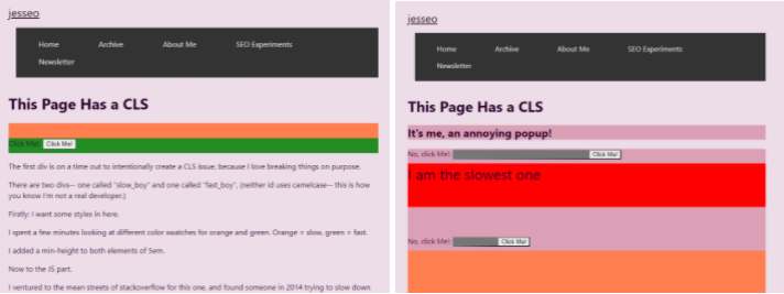
I basically set up all my divs with style=”display:none” and then replaced that with “inherit” after a few seconds. Unfortunately, my old top nav design gave this a good CLS score:

Because most of the screen was taken up by my huge-ass navigation. I swapped my navigation out with a smaller version, and presto chango:

You can find my ragetweets about this here.
Note: I’m fully ready to exploit the StackOverflow effect for this article, in that I’m expecting people to come and correct my mistakes. Don’t let me down, lol.
Sources for More: #
- Annie Sullivan:: Understanding CLS at Perfmatters conf 2020
- Shane Jones - Twitter Tips
- Brodie SEO - Twitter Tips
- Web.dev live day 1
- How To Find & Fix Layout Shifts with Chrome DevTools
- CSS Tricks - Initialisms and Layout Shifts
- Avoid Layout Shifts Caused by Web Fonts
- #223: Core Web Vital Tooling
- Slashing layout cost with content-visibility
- Cumulative Layout Shift in Practice
- Optimize Cumulative Layout Shift
- Highlights from Chrome Dev Summit 2020
- Cumulative Layout Shift, the Layout Instability Metric
- Layout Instability API - W3C Draft
- Cumulative Layout Shift - SEJ Guide
- Core Web Vital Tooling
- The Science Behind Web Vitals
- An in-depth guide to measuring Core Web Vitals